I love the new(ish) bank automatic teller machines (ATMs in the US or "CashPoints" in the UK) that scans checks and cash and makes them available for immediate deposit. Imagine recognition for the win! (Should I mention that Bell Labs was showing demos of this to NCR in 1997? What took you so long?)
Anyway...
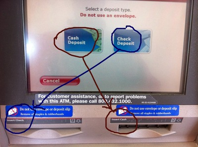
Here's a nitpick that I have with the user interface: The prompt is for "Cash or Checks" but the slots are in the reverse order, Checks on the left, cash on the right. (original photo is here)
Does anyone else find this annoying?
Anyone reading this blog know how to reach the developers at BoA to see if it can be fixed? This isn't the kind of thing I would report at their customer service phone number because it is my experience that there is no line of communication from customer support to the bugtracking/feature request system. Customer support people are usually trained to write down the suggestions just to be polite, they don't actually get submitted.
It would be amazing if companies could expose their bugtracking systems to the world. I'm used to this in the open source movement and would like to see it elsewhere too. The tech industry usually has a parallel bugtracking system that is exposed to the world, done this way to hide confidential information. I wonder how long before this kind of business practice works its way to other industries.
If someone could figure out a way to help companies provide an external view of their bugtracking system I'd be very happy. I'm very optimistic about the trend that Satisfaction has started, trying to re-invent customer support. Customer support is ripe for innovation.


My problem with these ATM is when you deposit multiple checks, it shows you the image for the first one so you can verify the amount. After the first one it doesn't show you the image anymore. I submitted a feedback about this once, but who knows what happened to it...